

Throughout February, I created mockup covers for my next book, The House with Two Faces (which I guess I should abbreviate to HTF, like I did with CSM). For the first few days, I kept adding and changing things, then added and changed more covers.
Here’s what the first poll looked like:
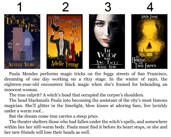
1, 3, and 4 got the most votes. A lot of people chose #1, I suppose because of its adherence to the title and its simple vector style which is similar to The Cycle of the Six Moons covers. But I wanted to make sure that this book has nothing to do with CSM, so I wanted to stray away from that.
I still liked #2, though, mostly because of how it has to do with “magic!” and those who actually read the synopsis made good points about the second cover.
So then, instead of narrowing down the results, I offered a bunch of alternatives.
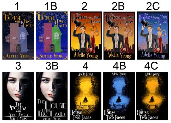
In the end, it came down to 3 and 4.
So I offered even more alternatives by making #1 look more art deco with the corner pieces and the font, and I liked the red I added to her face, so I added that to #2.
BUT IT WAS STILL MISSING THE MAGICAL ASPECT. So then I did THIS

And I really liked #3 because of magic and 20s buuuut still, the votes were super close between #1 and #2.
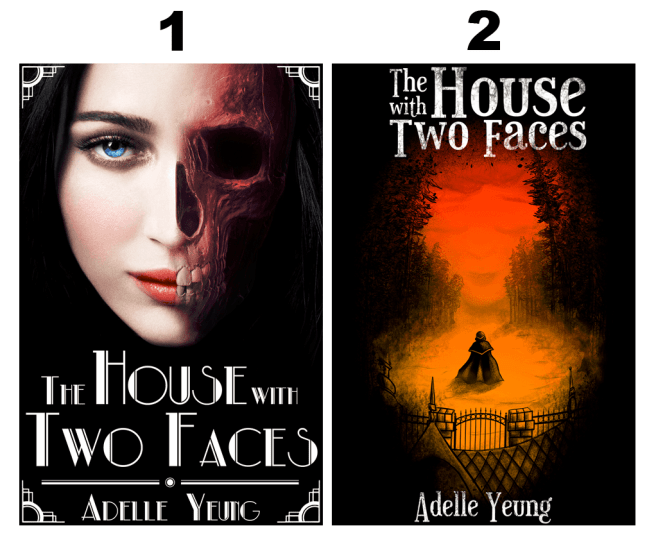
I gathered 357 votes total.
That put #1 at 44%, #2 at 38%, and #3 at 18%.
#1 was preferred by high school and middle school students, as well as girls.
#2 was preferred by people my age and older, as well as boys.
So, in the end, I guess we’re going with this one.

Which is actually my least favorite cover ’cause I just don’t prefer photographic images of faces on covers 😅
Anyway, this isn’t a “final mockup” cover. It’s just what I’m going to use when I post the first three chapters on Wattpad so I can get beta readers 🙂
